Design Spit-It-Out
I am a designer in Austin Texas who's lucky to have made it through the recession, stereotypes & conundrums - with that I'd like to share my experiences with you along the way. Design isn't always easy but it sure is fun & I've learned the hard way. Join me - lets play in the design world!
May 3, 2011
Stencil me this Batman...
I was inspired by an idea I conjured up when thinking about great DIY TV ideas for a news spot. The idea was to stencil a jute rug on one side which would allow it to be reversible & give a space the ability to transform on a budget.
Taking that idea I decided to stencil the glass on my patio furniture set. I did a messy job so that if it got scratched it will blend in perfectly. Such an easy & inexpensive (not to mention fun) way to revamp a sad & tired patio set. Who knew spring cleaning could be so much fun? Try these stencil tricks & see for yourself...
April 12, 2011
Center of Attention take over!

Need tips? Need ideas? Need centerpieces? Need design help? look no further! Center of Attention is at your service! Check out these pics!
Custom center pieces & champaign glasses add a touch of excitement & masculinity to this 80th birthday party!
Everyone had a fantastic time & didn't have to worry about the design or clean up... could hosting a party get much easier? We didn't think so!
April 11, 2011
The "Dainty" Sink Dilema
As a designer you have an idea of the ideal sink for the project. But, what happens when the sink just isn't quite dainty enough? All is well until you can't find a delicate vessel sink. What constitutes a "dainty" sink anyway? (answer: waiting for client response)
I didn't realize that picking out the sink would be such a headache, "welcome to being a designer", my team says... I like it better when its smooth sailing! No snags, no problems & no worries.
After showing the client 8 different sinks I'm now trying to narrow down the style. One would think that there's only so many designs out there... maybe its a custom piece.
 Is it glass, stone or porcelain?

Maybe its shaped like a delicate little flower... Client is a gardener, she'll love it... maybe not, she's not sold.
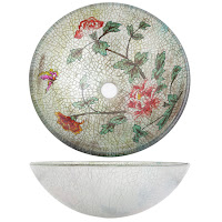
Perhaps the perfect sink is vintage inspired and crackled... No still not "the one", the design has too much red.
What if we recreate the vessel sink without the red? What if we commission an artist to hand paint a design that is just perfect? What if. (Answer: waiting for client response)
Can you see it? The perfect sink, the perfect powder bath, the perfect design.
 Is it glass, stone or porcelain?
Maybe its shaped like a delicate little flower... Client is a gardener, she'll love it... maybe not, she's not sold.
Perhaps the perfect sink is vintage inspired and crackled... No still not "the one", the design has too much red.
What if we recreate the vessel sink without the red? What if we commission an artist to hand paint a design that is just perfect? What if. (Answer: waiting for client response)
Can you see it? The perfect sink, the perfect powder bath, the perfect design.
'Tis the dilemma.
What do y'all think?
April 5, 2011
Design Gem of the house
Your powder bathroom is the gem of your house. This is where you are allowed to go a little wild (as far as design goes). Every guest that enters your house and needs to use the "facilities" will see this amazing space - don't you want them to gossip that you have the sexiest powder bath in the subdivision? Believe me, your neighbors talk...
My inspiration came when flipping through magazines & spotted this picture. This room shows an elegant & exciting new way to use wallpaper.
This is not grammy's wallpaper treatment is it? I am incorporating the wallpaper my client fell in love with by creating frames around each section using wood moulding. This "picture frame" effect will definitely modernize the overall look of the wallpaper treatment.
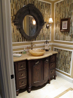
I gave the look a little twist with a classically elegant mirror & vanity combo. , especially after the mirror gets aged to match the colors & feel of the vanity.
** Tip: if you can't find the right color don't be afraid to paint it. You can get the look you want for the price you can afford. A can of paint is cheap and will change the whole look of a piece.

** Tip: thinking about aging a piece of furniture, art or fabric? Try these little tips...
1. Watered down paint can give a great effect when applied with either a rag or dry brush
2. Gel-Stain adds depth to painted and carved pieces when applied and rubbed off with a clean cloth
3. Coffe or Tea stain fabrics to tone down colors, hide stains or add a shabby-chic touch
Ta-Da a swanky new powder bathroom thats updated, elegant & fit for royalty. Prince (king charles spaniel) will feel right at home with the new look. I can't wait till the rooms done & I can show it off!
April 4, 2011
Art-Wine-Design

There's a little town West of Austin tucked away in the middle of the Texas wine country. If it weren't for the 30 mph speed limit most Texans would drive right through Fredericksburg & miss out on all of the fabulous little shops that adorn the corners - grab a glass of wine & have a look around!
As soon as we drove through "F-burg" I knew I NEEDED to stop at this beautiful boutique called RED. I begged the bf to indulge my desire for design & there it was - vintage heaven surrounded by art galleries, German cafes & wine. Everywhere you look there are wonderfully placed nicknacks organized in fantastic vignettes throughout the store. To the right, vintage inspired knobs nestled in groups upon a beautifully stained entry table. The various sized vases create the perfect frame for the brilliant colors & shapes!

 To the left, gorgeous bold printed fabrics, an energetic'n bright 16 square art piece & for added character 3 decorative busts to finish out the vignette.
Check out those shades! They're made from thin bamboo strips that allow just the right amount of light to shine through - perfect for ambient lighting over a dinner table or seating area.
Picture this: group three lamps (different shapes &/or sizes) over your favorite seating area, turning a drab corner into a calming, relaxing reading nook.
The boyfriend fell in love with this antique Ford sign, "Perfect for a man-cave" he says. Vintage signs are fun & easy to incorporate in any design.

I absolutely love lucite used in unexpected ways. These amazing chairs have a gorgeous light & airy silhouette, paired with a heavier feeling wood table is an awesome way to spice up any dinning room.
Inspiration Heaven.
March 31, 2011
The Black Hole Known As.... IKEA!
Yet again I've been sucked in by the Black Hole for time known as Ikea! I search and search for the best purchases (& most affordable) for my clients online, in catalogs & in stores - inevitably I end up at Ikea a few times a month.
Not one thing has changed since I was in there last - there aren't any new products i haven't already seen, sat in, or purchased... but somehow I'm sucked in for a minimum of two hours. I tell myself before I walk in that I'm going to take all of the shortcuts & speed walk past the other patrons... sigh! If I'm not sucked in by something shiny its the smell of mashed potatoes, mac-n-cheese & meatballs that I know are lurking in the cafeteria. Then to top it off they sell all too delicious cinnamon buns right before you walk out the door, as though you haven't eaten or wasted enough time already!
This go round I had a couple returns & needed to buy some new curtains for an client - sounds simple enough right... 2 hours later I was dazed, confused & hungry. I need an assistant if not simply to run to ikea but to keep me from gorging myself on meatballs & carbs.
I will update y'all with a picture of the curtains on the walls next week.... stay tuned!
March 30, 2011
(Design) Spit It Out...
Here's the new logo... What do y'all think?
Designspit.com will be up and running soon - now you can find all the info you want & need here. Also follow me on twitter @DesignSpit to get all of the juicy details that go on behind the scenes in the design world.
I started out in interior design almost 2 years ago with out any experience & let me tell you... it was SCARY! All I knew was that I wanted into this business & I it didn't matter how I got here. I pushed & shoved until finally a small design firm agreed to let me come play (as long as I stopped sending emails). Persistence definitely pays off!
I started out as a Designer's assistant which led to project management & now I am a small project designer! Wow it feels good doing what you love! I'm writing to share ideas, thoughts, projects, trials & tribulations. I hope y'all enjoy!
Subscribe to:
Posts (Atom)


